I basically had no choice but hot pink and bubble gum for such pretentious type. This font already knows everyone is head-over-heels in love with it. I love modern calligraphy, but that requires patience. So, I have Channel. This font balances ...
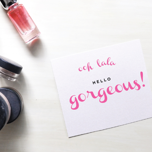
I basically had no choice but hot pink and bubble gum for such pretentious type. This font already knows everyone is head-over-heels in love with it. I love modern calligraphy, but that requires patience. So, I have Channel. This font balances ...
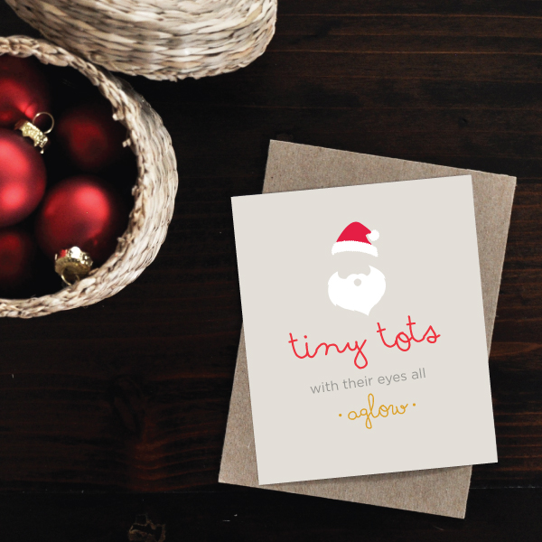
I’ve always loved these sweet lyrics from The Christmas Song. Drawing santa is way too much pressure—especially when all you need is a hat and beard for the visual queue. Just letting the negative space speak for itself. Remember my runner illustrati ...
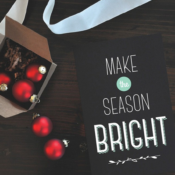
We all know I’m a sucker for a tall skinny font. And those dropped arms on the “E” and “F” — hello little loves! My favorite part of this type are all the weights—especially that striped shadow! Such a festive flair. Doesn't that bold shad ...
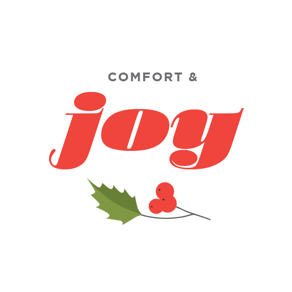
Decided to stick to traditional Christmas berry and olive color scheme today. This font is large and in charge, and all sorts of fancy. Swooning over this type, Stilla! Everything from the unique bell-bottomed "A", "M" and "N" to the overly plu ...
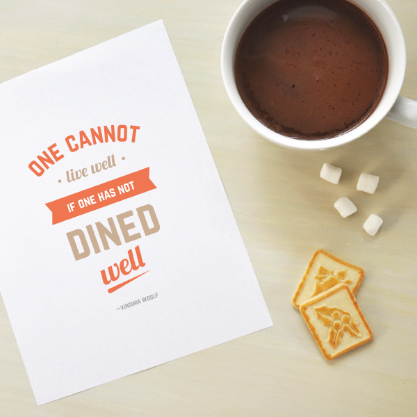
Norwester and Lobster 1.3 are one of my all-time favorite type combinations. I love this mysterious gray (with a purple past)— it goes so well with any color palette. Especially this soft rusty orange and tan. Norwester is definitely one of my ...
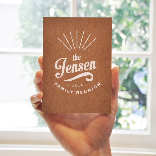
A thick script font with just the right amount of curl. I loved using this font for some family reunion invitations I designed. White on kraft for the win! Feeling vintage vibes from this type so I gleaned a little inspiration from old baseball tee ...
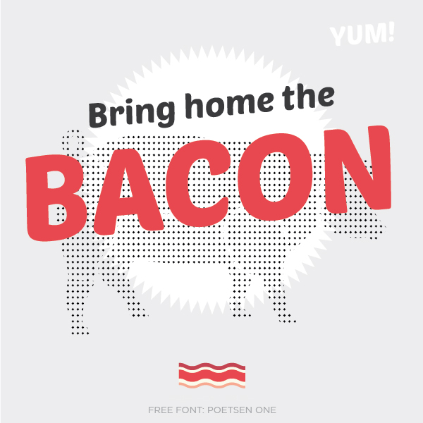
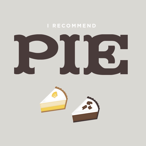
A basic gray and soft red color palette because this font was screaming brush script vintage to me which meant a halftone pattern was in order. And of course, bacon. Why not? The curvy flow of this fatty, bubbly font is oh-so fun. It was the pe ...
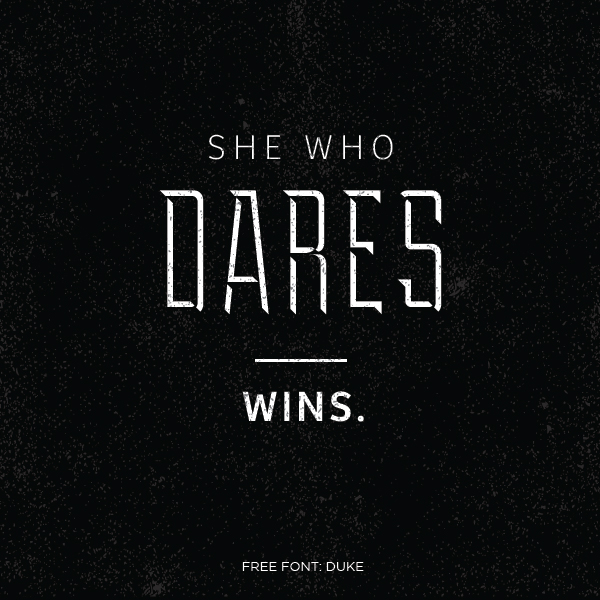
Such a powerful quote called for statue-strong type. Hello Duke! This font comes with three visual weights, fill, regular and shadow. I loved the shadow weight because it's beveled effect on the type that makes the font look like part of it has myste ...
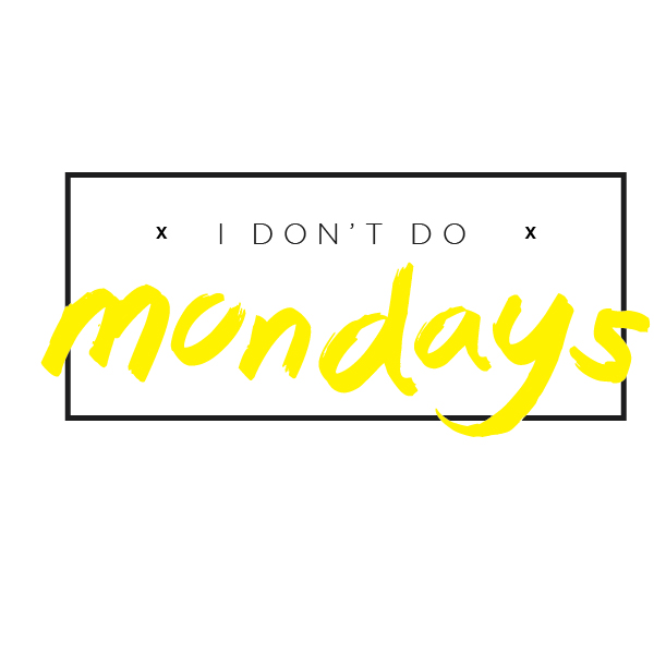
I feel like brush scripts get a bad rap. But this font feels all sorts of right. Especially when we're talking about Mondays. I'll be honest. I did modify some of the letters to be less….brushy. (I have my reasons!) but honestly, I love the sense of hurri ...
Scalloped slab serifs! Madfont, I'm so glad we met. (We all know wide-set font families are my personal love affair). Quite the appetizing color scheme if I do say so myself. There are so many good things happening in this type. These wide-s ...