So excited to start off our designer feature series with Leah Bisch! She is the brains and skill behind her own stationery business, Hatch & Mingle (do yourself a favor and visit her stunning site, you’ll thank me later). I just love her design sense. She’s a type combination pro, and does so in all the right ways possible. I know, she’s dreamy.

She also taught me that the correct spelling is “stationery” not “stationary” which honestly shattered my world for a good two minutes. (I passed English 2200 in college, I swear.)
About Leah…
“I love to laugh and I have a bit of a sarcastic side. At my core, I’d say I’m an introvert who needs time alone to recharge, but I love to get together with friends and family when time allows (which isn’t always easy with a toddler!). Having a creative outlet keeps me happy, I’m very self-motivated and I like to learn new things to enhance my design skills as much as possible. I wish I could say I was one of those super tidy and organized designers but unfortunately clutter follows me wherever I go (except in my file work! I like to keep those nice and clean). I love a good glass of wine. I enjoy travel and hope to do much more of it with my family as my daughter gets older.”
One of Leah’s save the date invites featuring the lovely Matchbook font. (It’s one of our favorites too! Download Matchbook for free here).

How did you come to love Graphic Design?
“My path to Graphic Design was a winding one. Growing up, I loved illustration and I was always involved in art through different classes, but it never occurred to me at the time that I could make a living doing something creative. In college, my interests shifted to earth sciences, but the class I ended up enjoying most was cartography. I absolutely loved designing the look-and-feel of the maps and I sometimes look back and wonder why it didn’t occur to me then to look into something like graphic design. As they say, hindsight is always 20/20! Post college, I ended up landing a job with a winery in Malibu. My position had many roles, but my favorite one was creating marketing materials and email campaigns for our company. I knew I had found my calling at that point and I took a big risk and left my job to return to school full time to get a formal education in graphic design. At the time, I was inspired by the book, “The Artist’s Way” by Julia Cameron and I would remind myself of the quote “leap, and the net will appear” whenever I felt my confidence in my decision wavering.”

“Luckily, the decision paid off and I eventually got a design internship which turned into a full-time position with a branding agency in Santa Monica, CA. After I had my daughter in December 2013, I felt it was time to start my own stationery and design business that would allow me to do the two things I love most: stay home with my daughter and continue my design career.”
So much to love about this moving announcement she designed!

White on kraft is all the rage, and that watercolor fill? To die for. We love her font choice too, it’s one of our staples. Download Thirsty Script for free, here.
In a world where money didn’t matter, what would your life be like?
“My husband and I met at UCSB and Santa Barbara is one my favorite cities in the world. I’d love to live there again one day. I’m fortunate to be doing exactly what I want to be doing for a living—I always say that if money were no object, I would still continue to design because it makes me so happy.”
What helps you get through a long workday?
“Coffee. Definitely coffee. And “Indie Folk Revival Radio” on Pandora.” (Check out the playlist here.)
What is your favorite free font? (drum roll please)
“There is love in my heart for the free font Novecento Wide. This font is like a chameleon to me because it blends so well into so many different design situations. It’s my go-to when I need a clean, solid sans-serif to offset something like a script or condensed style font. For stationery, I especially love the bold version set at a 7pt size with extra wide tracking.”
Did everyone catch that tip? 😉
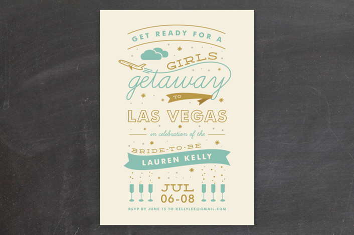
“I think I’ve used the Novecento Wide font in most things I’ve designed over the past year! If you look through my shop on Minted, you’ll see many examples of it but my favorite is:

“As you can see, there are a few fonts going on here but it’s not too overwhelming because Novecento Wide does such a great job of being a supporting act to fonts with more personality like Deming and Learning Curve [ahem, we’ve had our love affair with Learning Curve too! Download it free here]. It also looks pretty outlined!”

If this font were a person, what would that person be like?
“To me, Novecento Wide seems more masculine than feminine. I think he would be a pretty straight-laced, honest, and reliable guy. He also seems like he has good taste and would know how to order an excellent glass of wine.”
Uhm, I think we’d all like to take a drink with this stud too. Don’t forget to download 6 weights of Novecento Wide for free, click below!

