When I want to pretend like I’m fancy enough to throw a dinner party that needs 4 forks in one place setting…I use Theano Didot in the invitation. It looks more expensive and elite than I ever could be. Save this Theano Didot free font for something fancy!
Blush tones are so in right now, and I love how that pink hue brings a feminine touch to the masculine pair of brown and almost black. It balances a strong masculine presence, with a splash of feminine grit. Everybody wins!

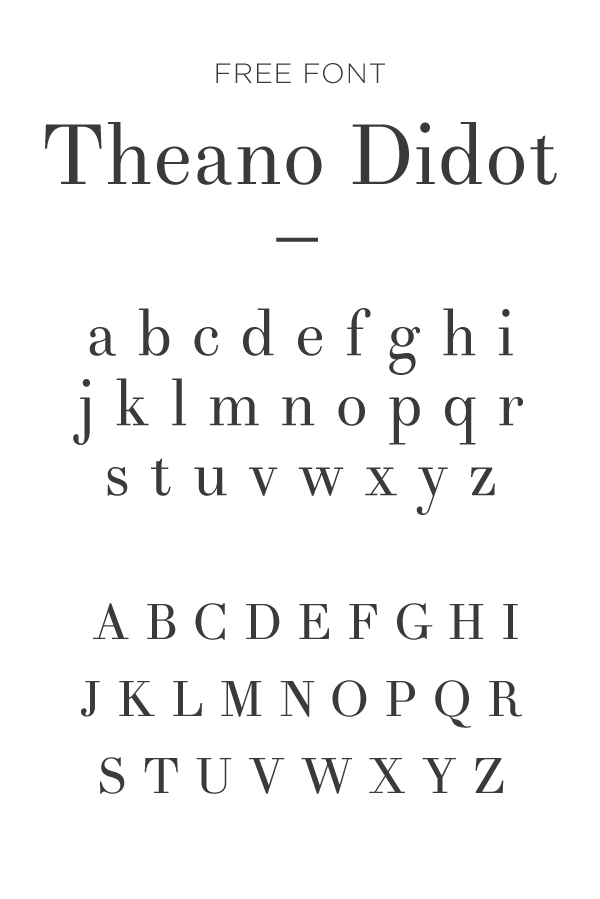
Theano Didot’s free font is almost identical to the letters from the Didot font (yes, the one born in the late 1700’s) with two exceptions: first, this Theano Didot free font isn’t as extreme with it’s thicks and thins, which makes this free font more readable at a smaller scale. And secondly, Theano Didot numerals sit on the same baseline (instead of varying baseline heights that are very much associated with old typography.) Score, and score.

We appreciate a good free serif font every once in a while, especially one that looks so elite and expensive. It’s a perfect font for wedding invitations for the classic bride. Or any fancy night for that matter!