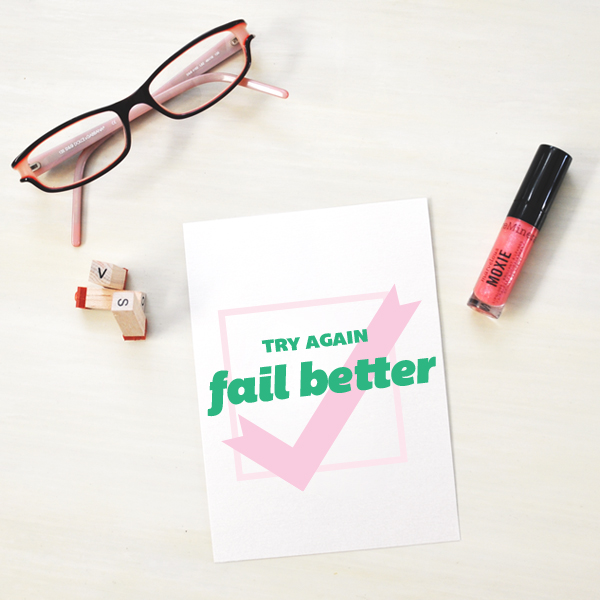
If you avoid failure, you avoid success. Free Font // Bemio Cotton candy and green color palette. If you’re asking me, blue gets too much attention these days (thanks corporate world) I feel like everyone is forgetting the wonderful hue green has t ...
Bree
Bree is always my go-to font when I need a soft and gentle look. Bright sky and a little neon. I needed a color palette mellow enough for this youthful type, but a punch of neon for awesomeness. Obviously we're in love with the gentle loopin ...
Nevis
Be brave enough to change “can’t” into “can.” Another perfect circle font. You already know how that makes me feel from experience with the Biko and Kilogram fonts….and the love affair continues with Nevis type. Am I even allowed to say Nevis is my ...
Loxley + Masana
I love literal type. A strong tall font for "big" and a tiny little script for "little." It's just all sorts of right in the world of font combinations! I reused this little script Masana—so click here to go my past post to download that font. (You ...
Biko
Making things happen today with the font Biko! I'm loving the color palette play on army tans and greens with a soft nude pink. Lovely! I love the high arms in this font! That "B" is to die for. I'm a sucker for perfect circles, so yeah, I'm ...
Arvil
I have my New Years resolutions in writing now (in Arvil Sans and Grand Hotel fonts to be exact). There is no going back! There's just something so appetizing about a yellow and tan color scheme, or is it my olive oil and bread? I love Arvil ...
Canter
We all know I’m a sucker for a tall skinny font. And those dropped arms on the “E” and “F” — hello little loves! My favorite part of this type are all the weights—especially that striped shadow! Such a festive flair. Doesn't that bold shad ...
Norwester + Lobster 1.3
Norwester and Lobster 1.3 are one of my all-time favorite type combinations. I love this mysterious gray (with a purple past)— it goes so well with any color palette. Especially this soft rusty orange and tan. Norwester is definitely one of my ...
Poetsen One
A basic gray and soft red color palette because this font was screaming brush script vintage to me which meant a halftone pattern was in order. And of course, bacon. Why not? The curvy flow of this fatty, bubbly font is oh-so fun. It was the pe ...
Duke
Such a powerful quote called for statue-strong type. Hello Duke! This font comes with three visual weights, fill, regular and shadow. I loved the shadow weight because it's beveled effect on the type that makes the font look like part of it has myste ...