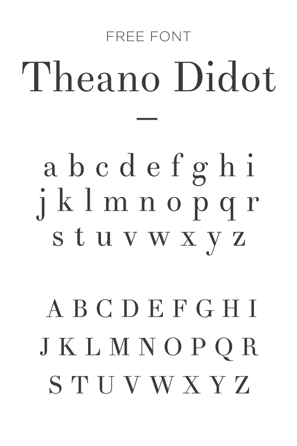
When I want to pretend like I’m fancy enough to throw a dinner party that needs 4 forks in one place setting…I use Theano Didot in the invitation. It looks more expensive and elite than I ever could be. Save this Theano Didot free font for something fancy ...
Barkentina
They say the cure for anything is salt water—sweat, tears, or the sea. Let's start with the sea...and an umbrella in my drink! Anyone else wanting natures therapy? First off, before you get all bothered about the lack of color palette here just know ...
Bedini Bold Italic
Where are all my queens at? I’ll be honest. I absolutely despise red + black together. I almost hate myself for using the two together. I am partly ashamed I fell into this trap myself. But here I am, with Bedini. And I think it actually looks O.K. ...
Sail
Happy New year! Keeping it fresh with a happy, poised serif. Although, the long overhanging arm on the "r" makes me a little uncomfortable. (oh well). A fresh mint and gold color palette might be my new latest obsession (along with everyone elses). ...
Stilla
Decided to stick to traditional Christmas berry and olive color scheme today. This font is large and in charge, and all sorts of fancy. Swooning over this type, Stilla! Everything from the unique bell-bottomed "A", "M" and "N" to the overly plu ...
Cooper Black
Throwing it back to the Apple II computer in 1977. I love the play on dimension here, a simple line drawing with the oh-so-popular 3-d shadowing. Capturing that old advertising feel with some dirty paper hues and none other than Cooper Black. ( ...
Nouvelle Vague
Talk about a black tie font! But, paired with a spirited innocent doodle pattern and some flat layering (we're all about that right now) helps this fancy type loosen up a bit. I'm gushing over the extremity in the thicks and the barely-viewable thi ...